Branding


Wordmark
Temaki's wordmark incorporates Outfit's variant letterset. The variant lowercase "t" has a terminal that motions to the "e" and upholds whimsical feeling. The decision to use a lowercase "t" was to allow the brand to feel inviting and modern. Using variant letters was one way to differentiate Outfit's usage as a body copy typeface and in branding.
Logo/Favicon
Taken from the wordmark, the fish head is a nod to the key component of Temaki. The fish head functions as the letter "e". It was designed using fragmented parts of Outfit's letters. The eye is an "O" and the gills are made from Outfit's variant lowercase "m".
Design System: PLECO
Temaki's design system was named after Hypostomus Plecostomus, more commonly known as the Suckermouth catfish or "suckerfish." Much like a suckerfish will clean the common fish tank, I dubbed the system "PLECO" to highlight the task at hand and to dually allude to the goal of "sucking up" competitors' user base.
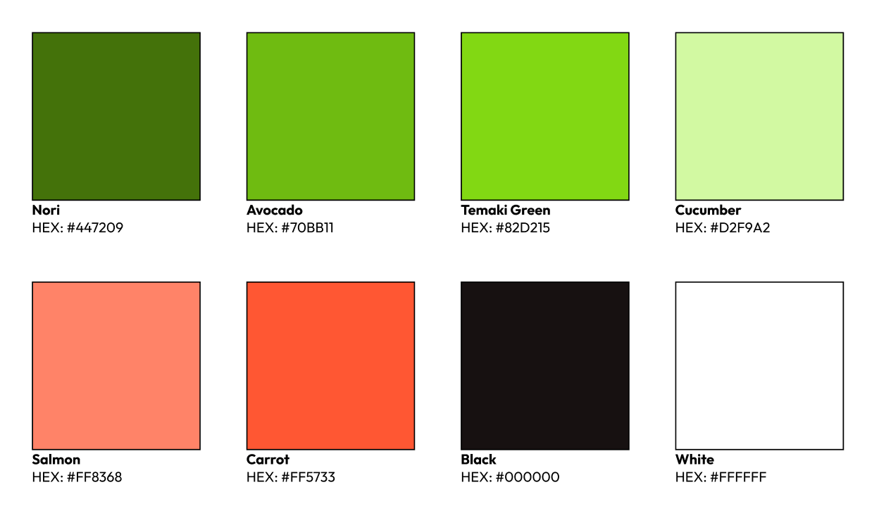
Brand Colors
The colors are directly sourced from salmon and cucumbers which are typically found in Temaki.
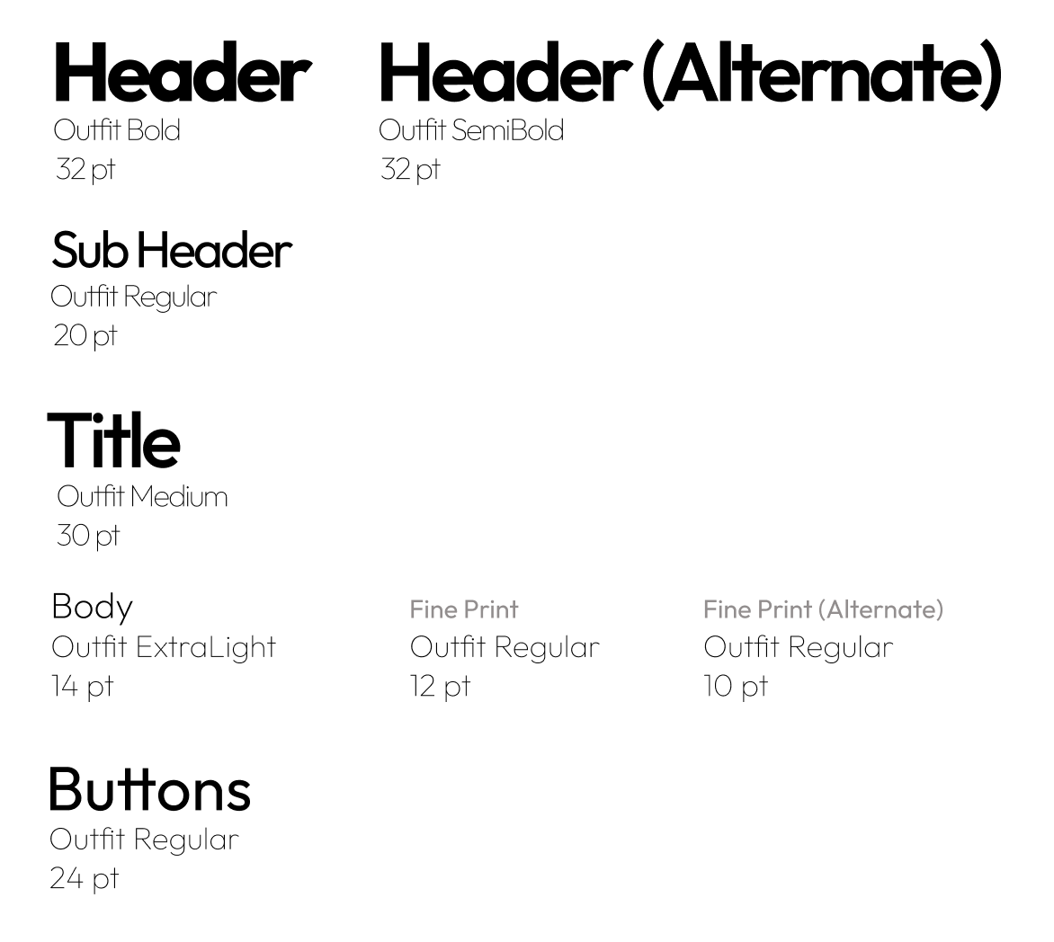
Typography
"Outfit" by Rodrigo Fuenzalida is a clean, modern, round, typeface and most importantly: friendly. It encapsulates the refreshing nature of the brand.
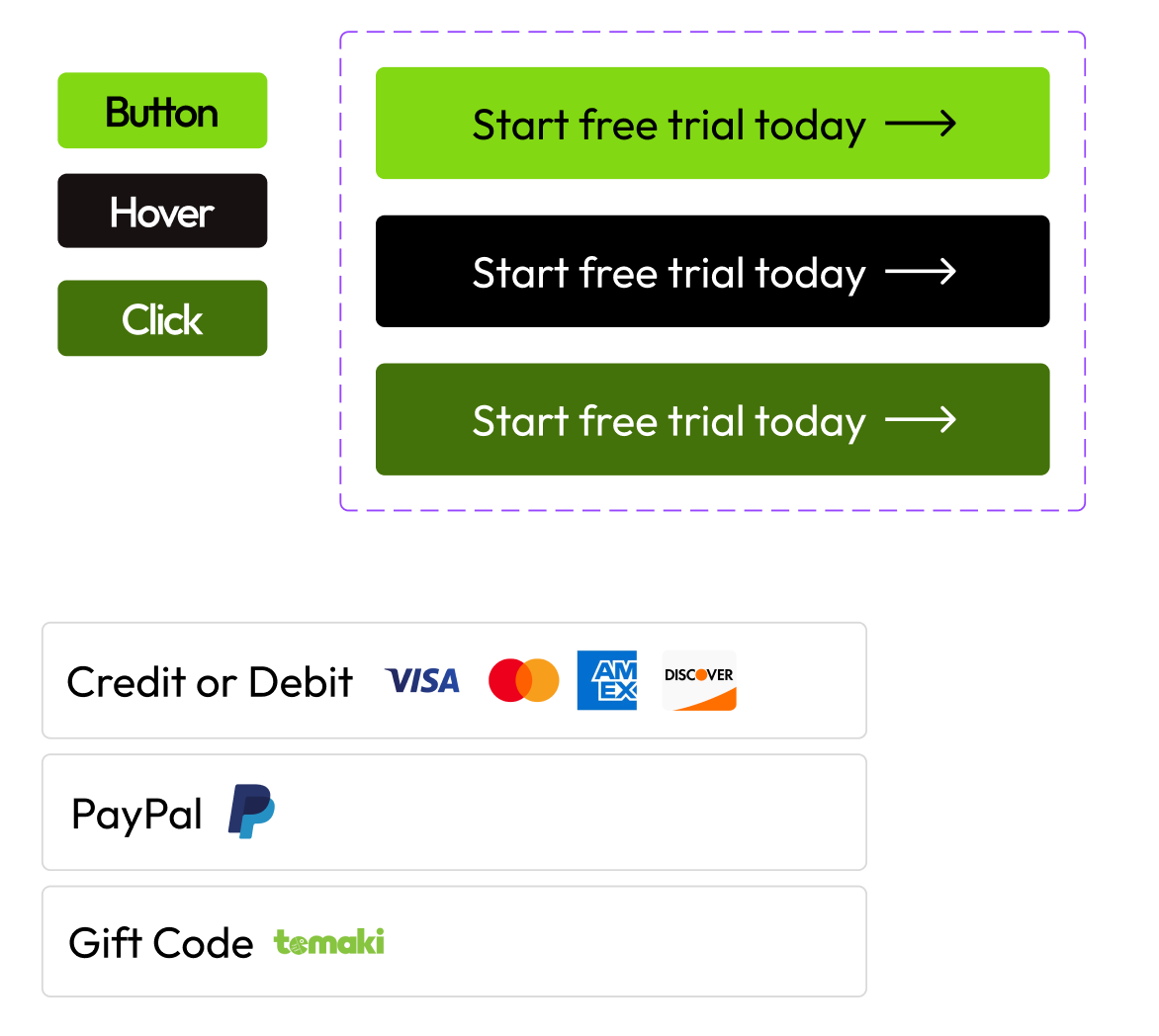
Button Style
In order to keep a welcoming aesthetic, button corners are slightly rounded. Repeating Temaki Green in important elements such as buttons plants the seed of familiarity of the brand for users.
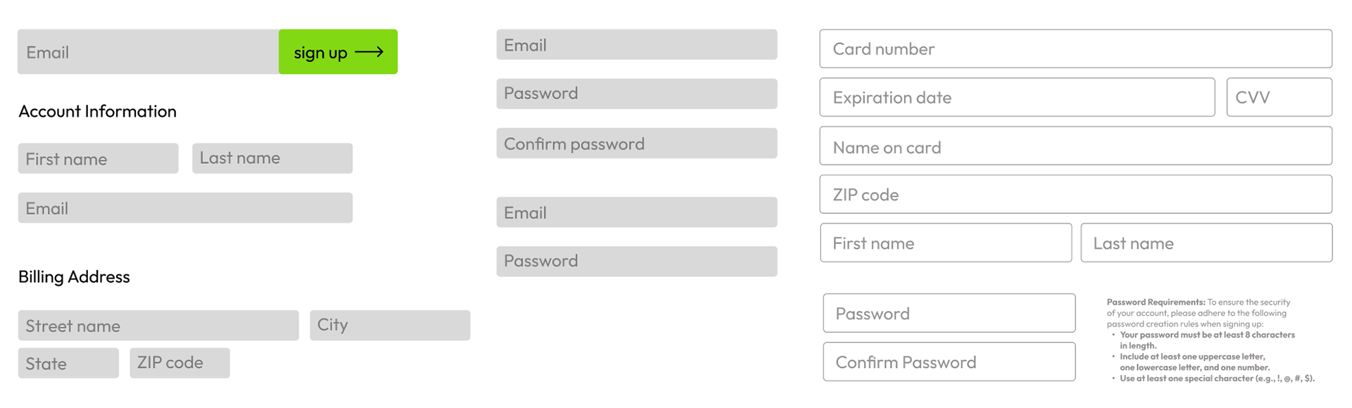
Form Fields
Keeping with the same rounded corners, the form fields are meant to feel casual to avoid the clinical experience of customers providing their information.
[Some] Components
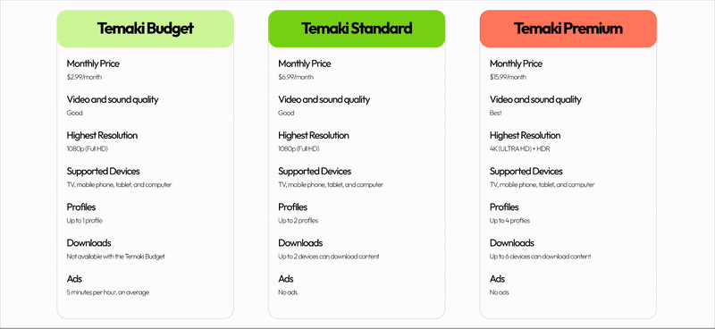
Plan Selection Component: When selecting a plan, a drop shadow is applied to show selection is active. When the user clicks Temaki Standard, the component's button changes to a gradient that transitions from Temaki Green to Salmon. The purpose of the gradient is to visually guide the user to select Temaki Premium as it is also Salmon.
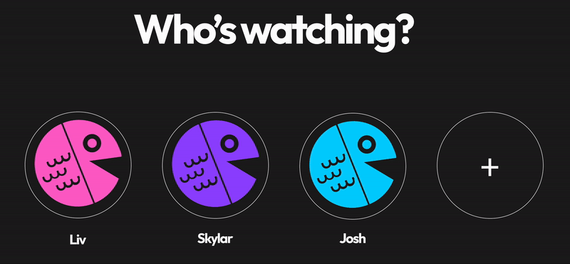
User Profile Selection: To further brand recognition, default user profile pictures are different colored variants of the Temaki logo.